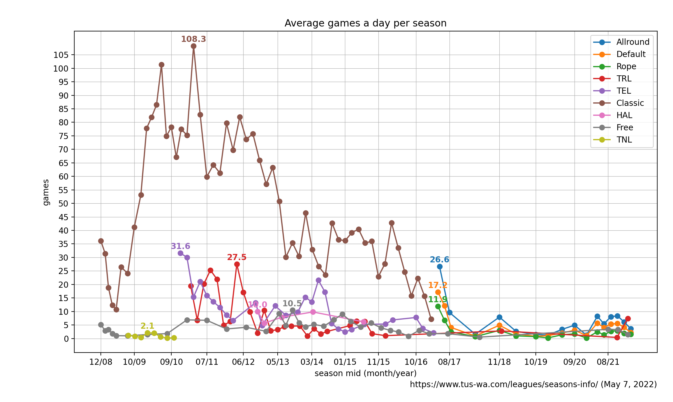
I assume we all feel activity declining for the last decade. I did the math.
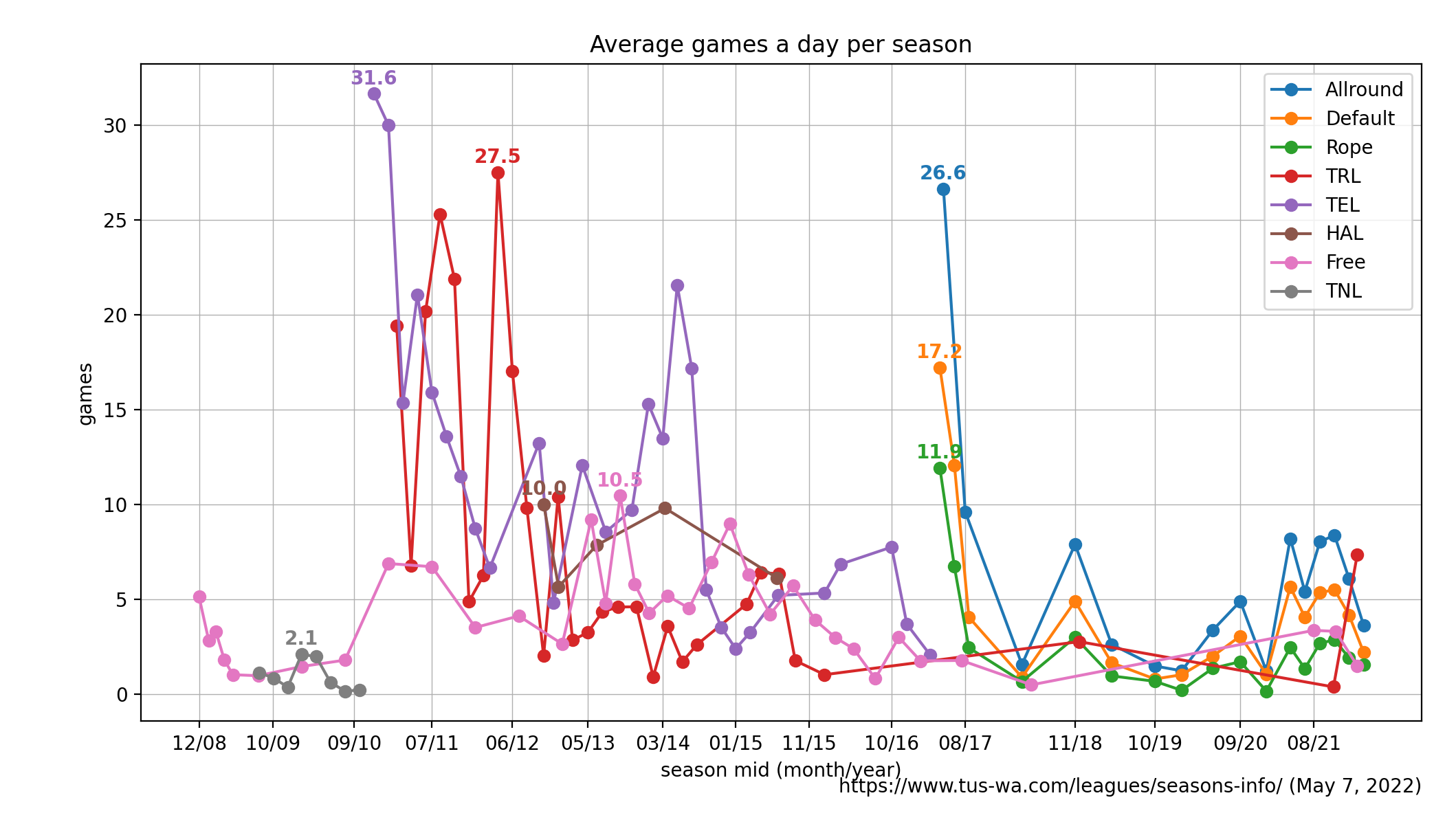
Again without Classic league as it distorts the view.
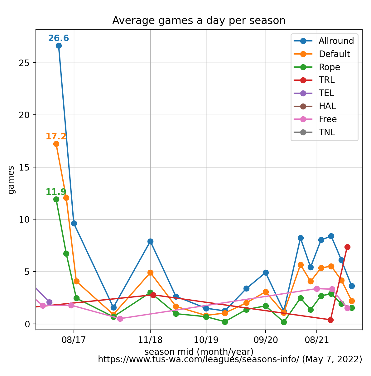
Zooming in on more recent years.
Here's NNN league activity. Some data is inaccessible unfortunately. I have attained conflicting versions of data, so there are two plots.
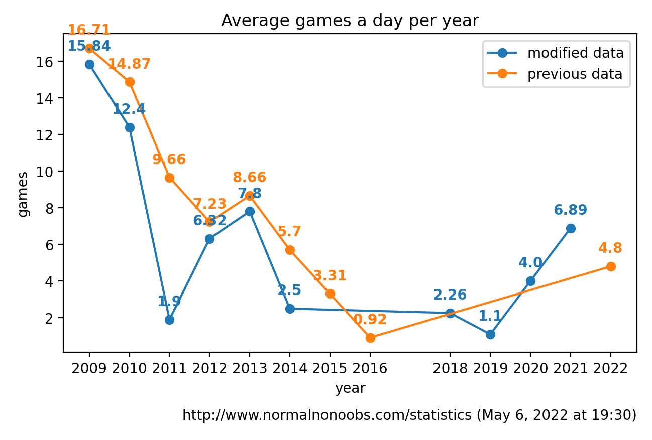
These graphs as an attachment:


The script that made these graphs:
#!/usr/bin/env python3

from datetime import datetime as dt, timedelta
from functools import reduce
import re

def fmt_dt(s):
  return dt.strptime(s, '%B %d, %Y, %H:%M:%S')


with open('tus.tsv', 'r') as f:
  ll = [x.split('\t') for x in f.read().splitlines()]

R = {l[0]: [] for l in ll }
for l in ll:
  start = fmt_dt(l[2])
  end = fmt_dt(l[3])
  g = sum([int(re.sub('[^\d]', '', s)) for s in l[4].split(', ')])
  dur = (end-start).days+2
  R[l[0]].append((start+(timedelta(days=dur/2)), g/dur, 2))

for k,v in R.items():
  R[k].sort()

import matplotlib.pyplot as plt

mx_y = 0
for l,vv in R.items():
  xs = [v[0] for v in vv]
  ys = [v[1] for v in vv]

  plt.plot(xs, ys, 'o-', label=l)

  mx, mx_i = -1, -1
  for i,(x,y) in enumerate(zip(xs, ys)):
    if y > mx:
      mx = y
      mx_i = i
  mx_y = max(mx, mx_y)

  label = "{:.2f}".format(y)
  plt.annotate(round(mx, 1),
               (xs[mx_i],ys[mx_i]),
               textcoords="offset points",
               xytext=(0,5),
               weight='bold',
               color=plt.gca().lines[-1].get_color(),
               ha='center')

plt.yticks(range(0, int(mx_y), 5))
xticks = sorted(list(set([a[0] for b in R.values() for a in b])))
xticks = (reduce(lambda acc, v: acc + [v] if len(acc) == 0 or (v-acc[-1]).days > 300 else acc, xticks, []))
plt.xticks(xticks, [d.strftime("%m/%y") for d in xticks])
plt.grid(True, linewidth=0.5, linestyle='-')
plt.ylabel('games')
plt.xlabel('season mid (month/year)')
plt.title('Average games a day per season')

plt.annotate('https://www.tus-wa.com/leagues/seasons-info/ (May 7, 2022)',
             xy = (1.0, -0.1),
             xycoords='axes fraction',
             ha='right',
             va="center",
             fontsize=10)

plt.tight_layout()
plt.legend()
plt.show()
Data from
https://www.tus-wa.com/leagues/seasons-info/ in TSV format:
tus.tsv
 Forums
 Türkçe
 Español (ES)
 Polski
 Deutsch („Sie“)
 Norsk
Norsk
 Suomi
Suomi
 Български
 Nederlands
 Italiano
 Magyar
 Português
 Română
 Svenska
 Русский
 Українська
 Dansk
Dansk
 Croatian
 Français
 English